
The Number Nobody Checks Until It Is Too Late
Open any website you have worked on. Right-click, inspect, go to the Network tab, and filter by images. Look at the total weight.
On most sites, images account for 50-70% of the total page size. Not JavaScript. Not CSS. Not fonts. Images. A single uncompressed hero banner can outweigh your entire stylesheet, your framework bundle, and your web fonts combined. And yet, when people talk about performance optimization, they reach for code splitting, lazy loading scripts, and tree shaking things that shave off kilobytes while megabytes of image data sail through unquestioned.
That is the disconnect. You can optimize every line of code on your site and still have a slow page if your images are heavy.
What Actually Happens When a Browser Loads a 3MB Image
A browser does not just "show" an image. It requests it, waits for the server to respond, downloads the data byte by byte, decodes the compressed format back into raw pixel data, and then paints those pixels on screen. Every one of those steps takes time and resources.
On a fast office connection, a 3MB JPEG might download in under a second. Feels fine. But your visitors are not all on fast office connections. A significant portion of web traffic comes from mobile devices on 4G or slower — connections where that same 3MB image takes 4-8 seconds to arrive. During those seconds, the user stares at a blank space where the image should be, or worse, the entire layout shifts when the image finally loads.
Multiply this by every image on the page. A product grid with 20 items? That could be 15-40MB of image data. A blog post with inline screenshots? Easily 8-12MB. The browser cannot render what it has not received, and it cannot receive data faster than the connection allows.
This is not a theoretical concern. Google measures it.
Core Web Vitals and Why Google Penalizes Heavy Images
Three metrics determine how Google evaluates your page experience: Largest Contentful Paint (LCP), Cumulative Layout Shift (CLS), and Interaction to Next Paint (INP). Images directly affect the first two.
LCP measures how long it takes for the largest visible element to finish rendering. On most pages, that element is an image — a hero banner, a product photo, or a featured post thumbnail. If your LCP exceeds 2.5 seconds, Google considers your page experience "needs improvement." Beyond 4 seconds, it is rated "poor." Both hurt your search ranking. I have watched sites drop 10-15 positions in search results purely because of slow LCP caused by oversized images.
CLS measures visual stability. When an image loads without explicit dimensions, the browser allocates no space for it. Once the image arrives, everything below it gets shoved downward. Users clicking a button suddenly find themselves tapping something else because the layout jumped. This frustrates visitors and Google alike.
The fix for both is the same: smaller images that arrive faster, served with correct dimensions so the browser knows exactly how much space to reserve before the data lands.
The File Format Problem Nobody Told You About
Most websites still serve JPEG and PNG images. These formats were designed in the 1990s. They work, but they carry decades of technical baggage.
JPEG handles photographs reasonably well at moderate quality, but its compression algorithm is blunt. Push the quality below 70% and the image falls apart — blocky artifacts around edges, muddy gradients, that unmistakable smearing. So most people leave quality at 80-90% and accept the larger file size as inevitable.
PNG is even worse from a size perspective. It uses lossless compression, meaning the file preserves every pixel perfectly — noble in principle, devastating in practice. A single PNG screenshot can be 2-4MB. A transparent logo that would be 15KB as an SVG might be 300KB as a PNG. And there is no quality slider to turn down. The file is as small as lossless compression allows, and that is it.
WebP exists because Google's engineers looked at this situation and asked a straightforward question: what if the compression algorithm was just better? Not a little better. Fundamentally, structurally better.
The answer was predictive coding — instead of storing each pixel independently, WebP predicts what neighboring pixels should look like and only stores the difference. On photographs, this produces files 25-35% smaller than JPEG at the same visual quality. On graphics and screenshots, 40-60% smaller than PNG with identical pixel-level fidelity. According to Google's compression studies, these numbers hold across thousands of test images. Same images. Same visual result. Dramatically less data.
Real Numbers From Real Websites
Abstract percentages do not mean much until you see them in context. Here is what the difference looks like on actual pages:
A product category page with 24 items, each showing a 600x600 product photo. As JPEG at 85% quality: approximately 4.2MB total image weight. Converted to WebP at 80% quality: approximately 2.1MB. Same images, same visual quality, half the data. On a 4G connection, that is the difference between a 6-second load and a 3-second load. On a 3G connection, it is 15 seconds versus 8.
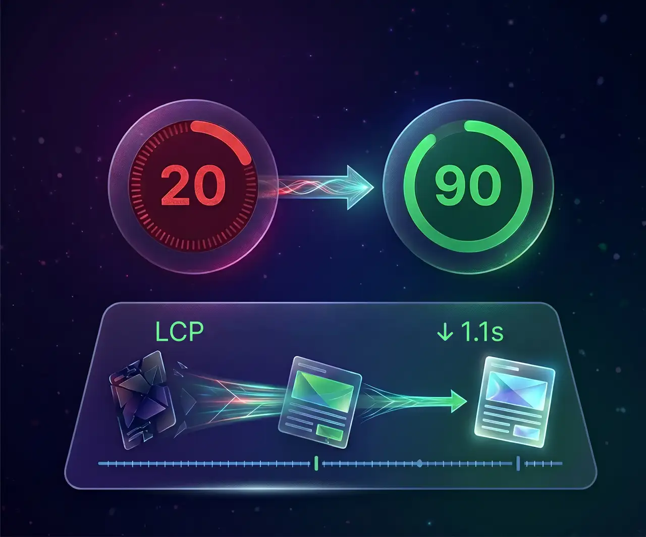
A blog post with five inline images and a hero banner. The originals — a mix of PNG screenshots and JPEG photos — totaled 7.8MB. After converting to WebP with appropriate quality settings (85% for screenshots, 78% for photos): 2.9MB. The Largest Contentful Paint dropped from 4.1 seconds to 1.9 seconds. That single change moved the page from "poor" to "good" in Google's assessment.
These are not extreme examples. This is what happens on average when you switch formats.
But Will My Images Look Worse?
This is the question that stops most people. They hear "compression" and think of those JPEG artifacts from 2005 — the blocky, smeared, obviously degraded images that looked like they had been faxed twice.
WebP compression does not work that way. At 75-85% quality, the output is visually indistinguishable from the original. Not "almost the same" — actually indistinguishable. You can put them side by side on a retina display and struggle to spot a difference. Google's own compression studies confirm this across thousands of test images.
The reason is that WebP is smarter about what it discards. JPEG throws away data in fixed 8x8 pixel blocks, which is why you see those characteristic blocky artifacts at low quality. WebP uses variable block sizes and prediction-based encoding, so the compression artifacts are distributed more naturally and become visible only at much more aggressive compression levels.
For most web use cases — product photos, blog images, hero banners, thumbnails — there is a comfortable quality range where the file is dramatically smaller and the image looks identical. That range exists. It is not a marketing claim. It is measurable, demonstrable, and the reason Google built the format.
The Fix Takes Less Time Than You Think
Converting your existing images to WebP does not require rebuilding your site, learning a command-line tool, or installing software. Tools like WebPImg handle it directly in your browser — upload your images, adjust the quality slider, and download optimized WebP files in seconds. No signup, no watermarks, no software to install.
For a site with dozens of images, WebPImg's batch conversion processes up to 50 files at once. Upload the lot, apply consistent quality and resize settings, download everything as a single ZIP archive. The entire product catalog of a small e-commerce store can be converted in an afternoon. A blog's image library might take twenty minutes. I have personally run through 300+ images for a client's Shopify store in under an hour using this workflow — batch upload, convert, replace.
WordPress 5.8 and newer support WebP natively in the media library. Shopify displays WebP automatically when the browser supports it. Most modern CMS platforms have either built-in support or a single plugin that handles the conversion on upload.
The effort is low. The impact is immediate. And unlike most performance optimizations, this one does not require ongoing maintenance — once an image is converted, it stays converted.
What Happens After You Switch
The first thing you will notice is your PageSpeed score improving. Not by 2-3 points — often by 15-25 points, because images are usually the single largest performance bottleneck. The "Serve images in next-gen formats" warning disappears. LCP drops. Total page weight shrinks.
The second thing you will notice is that nothing else changes. Your site looks the same. Your visitors see the same images. Nobody emails you to say the photos look different. The improvement is invisible to everyone except the browser, the search engine, and the speed test.
That is the entire point. The best performance optimization is one your users never notice happened — they just have a faster experience, and they stay longer because of it.
Your images do not need to be heavy. They just need to be in the right format.